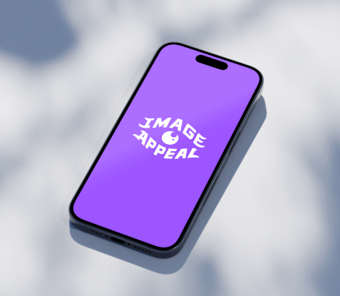
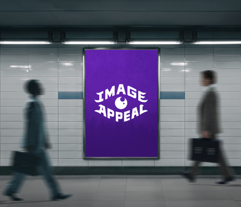
Visual expression is crucial for brand identity. We helped Image Appeal define their visual language by establishing their positioning and core messaging. Crafting a cohesive visual identity, from logos to digital assets, we ensured their brand remains consistent and recognizable. At SymbolSense, we’re not just a design agency; we’re visual storytellers, empowering Image Appeal to stand out with confidence.
To construct a comprehensive brand system for Image Appeal, we consistently drew upon its core attributes of creativity, innovation, and professionalism when determining brand elements. For the Typography Montserrat serves as the backbone of the brand system, offering a harmonious typeface that complements while conveying a sense of balance.